In the previous article we discussed about accounting fundamentals. Here we show you how to practically use these information for business decision making. Like before we are going to use Google sheets for demonstration. Google Sheet is a spreadsheet provided by Google which is alike the Microsoft Excel. Preparation of financial statements and other reports are not valuable if the users do not utilize them in the decision making process.
Expense Analysis
Google sheets could be utilized to prepare the summary of a massive data set. This is extremely useful to take the overall idea regarding a variety of data.

Delivery Cost Summary
The above data set represents the delivery cost for the first quarter of 2020. It’s difficult to get a proper idea and would be unable to identify the accurate pattern of delivery cost of QST Enterprise by looking at the total delivery costs of each order that occurred in the entire three months. However, if you would utilize Google Sheets to summarize the concerned massive data into a summary, it would assist you in arriving at correct conclusions and to identify the fluctuations of delivery costs during the particular period.
For an instance, when the summary of delivery cost is considered, a business owner would apply the total cost, average cost, maximum cost value, and minimum cost value to grab the overall image of the delivery cost in the first quarter. The said values could be easily calculated by using the formulas of Google sheets such as SUM for the total cost, AVE for the average cost, MAX for the maximum value, and MIN for the minimum value.
• The total cost of January =SUM (C4:C14)
• The Average cost of January =AVG (C4:C14)
• The Maximum cost of January =MAX (C4:C14)
• The Minimum cost of January =MIN (C4:C14)
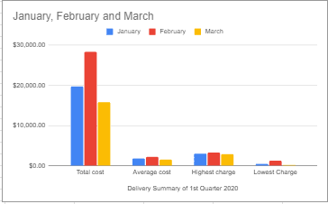
The first table in the image shows all the data points we need to consider. The second table is the summary of all these data.
Total delivery costs of January, February, and March are recorded as $19,706, $28,331, and $15,732 respectively. February has recorded the highest total delivery cost value for the quarter out of all the three months concerned. Average delivery costs of the said three months are $1,791.45, $2,179.31 and $1,573.20 respectively. The highest average delivery cost is reported in February as $2,179.31. On the other hand, the table depicted above represents the highest and the lowest delivery cost of each month out of total orders. The highest delivery cost is recorded as $3,240 in February and the lowest delivery cost is recorded as $230 in March. The highest delivery charge of January is $2,956 and March’s highest delivery charge is $2,900. The lowest delivery charge of January is $501 while it is $1,325 in February.
This summary can be displayed by using a graphs function available in Google Sheets. It would provide an appreciable presentation of the entire data set. The graph depicted below has highlighted February as the month which has recorded the highest total cost, highest average cost and also highest delivery charges.
Delivery Cost Summary Graph
Total delivery cost, average delivery cost and highest delivery charges are recorded in the same month in the first quarter as February. Hence, the management or owner needs to seek the reason for the considered increment of delivery cost recorded in February and they would be able to seek for the best alternative methods easily such as finding discounted suppliers, insuring with the third party, outsourcing the delivery process, obtaining discounted delivery rates and transforming for new strategies to reduce the delivery cost up to a significant level.
Monthly Sales Summary
Google sheets is especially useful when the user has to analyze trends and patterns of a particular data set during a specific period of time. Monthly sales values differs each month due to numerous reasons such as unexpected situations, new trends, market changes, consumer behavior changes, promotions and marketing campaigns, etc.
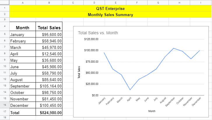
Depicted above is the sales summary of QST Enterprise for the year 2020. No one would be able to decide sales pattern or trend in an entire year by looking at these figures. Let’s use graphs and charts feature offered by Google Sheet to get a better picture/visualise this data set.
Let’s now analyse the line graph we generated using the sales data set. The line graph depicts both upward trends and downward trends during the period. We can’t see a steady sales growth here. According to the graph, total sales from January to April have experienced declining trend. Total sales have reported a significant rise over the period from May to September in 2020. On the other hand, it has reported a significant decline in total sales during the period of October to November, while that pattern has reversed at the beginning of December with increase of total sales by some amount.
Let’s now dive deep into possible causes of this graph and try to seek reasons for this trend. One possible cause is Corona lockdown situation. Since the government decided to lock down the country from the beginning of February due to the worldwide Coronavirus pandemic and we can assume consequently the total sales recorded a significant decline during that period. However, the country was opened at the beginning of May, as a result, the total sales signified an upward trend until September. Furthermore, QST Enterprise seems to have increased the allocations for marketing and promotion campaigns to enhance sales during the period. However, a trend of decline was recorded from October to November due to the country’s lockdown against the second wave of the Corona virus pandemic. Thereafter, the total sales have elevated in December due to a possible promotion campaign and the high demand for Christmas season.
Data visualisation allow the business management or the owner to forecast the future outlook and device strategies to cope with impact from uncertainties. In the example the business endured a remarkable impact due to lockdown. The business should have strategically adopt to this challenge. They could have decided on alternative ways to sell their products like creating an online store or sell through social media pages such as Facebook or Instagram.
Income Statement Comparison
Financial statements indicate the status of financial position, financial performances and cash flow status of an organisation. Data comparison is one of the use cases you can perform with Google sheets.

The income statement of QST Enterprise provides information such as business income, expenses and the net profit or loss for the period. It is worth comparing income statements from previous years with with the current year data to identify the upward or downward trends in the financial performance of the venture.
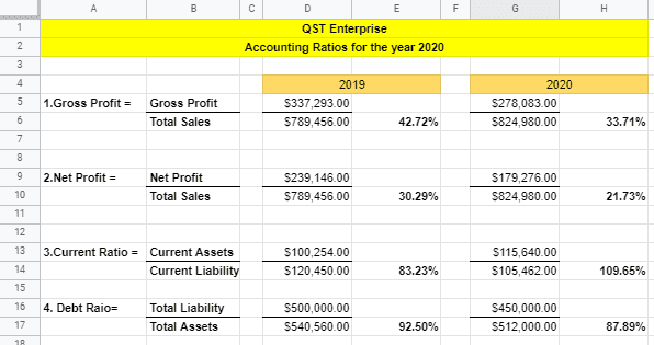
According to the image, the current year net profit of QST Enterprise is $179,276 after deducting all expenses incurred during the year for sales and operational activities. On the other hand, Gross profit is recorded as $278,083 in 2020. Company has been able to achieve a net profit instead of a loss so that’s a good thing but in order to praise this achievement we need to first check how does this profit compares with the previous year. This is the only way we can give a verdict about financial performance of this venture. Total sales have been recorded as $824,980 in 2020. This figure is $35,524 higher than previous year total sales value. On the other hand the cost of sales of QST Enterprise in 2020 is also higher than the previous year’s cost of sales value. As a result, the gross profit margin of 2020 has decreased by $59,210 compared to the gross profit margin of 2019. Likewise for other items you can see how the values has been changed over the 2 years. Ultimately, the net profit value of 2020 is $179,276 which is lower than net profit value of 2019. So as you can understand this achievement isn’t very impressive.
Sales revenue has increased in 2020 may be due to new marketing strategies employed by the owner to mitigate the risks came with the lockdown. However, it becomes evident that sales growth is inadequate because, the cost of sales has increased by a significant amount in the current year compared to the previous year. The owner should try to check what was the reason behind such increase in cost of sales.
Accounting Ratios and their Interpretation
Ratio analysis is another important set of calculations that we can derive from financial statements data. When comparing with previous years these ratios can uncover issues that can be detrimental to business success.
Ratios are mainly applied to find the status of an organization’s liquidity, profitability, solvency, and efficiency. Ratios can be easily calculated with Google sheets because of its cell linking feature. We just have to assign correct cells that corresponds to the formula headings and hit enter.
Gross Profit margin is calculated by total gross profit as a proportion of total sales. Gross profit and total sales values can be directly linked from financial statements to calculate the ratio. So, QST Enterprise has gross profit margin of 33.71% in 2020. It means the business has made ~34% gross profit from a sale. It is lower than the 2019 gross profit margin. Net profit margin is calculated as a percentage of total sales. It is 21.73% in the year 2020 and 30.29% in 2019. The management should check why there’s such significant drop in gross profit margin and net profit margin in 2020 compared to 2019.
The current ratio also known as liquidity ratio represents the business’s capacity or ability to cover short-term liabilities using current/short-term assets. The current ratio is higher in 2020 than the current ratio of 2019. In 2020, QST Enterprise possesses a 100% ability to cover their current liability using their current assets.
Debt ratio measures the leverage/debt situation of an organisation. The debt ratio of 2020 has decreased when compared to the 2019 ratio. Both years’ debt ratios are below 1 and this suggests the majority of the organisation’s assets are financed by equity instead of debt.
When analysing ratios of QST Enterprise, gross profit and net profit margins have recorded a declining trend in 2020. It is a negative sign for the company’s profitability side. Therefore, the management should make necessary adjustments to reduce cost of sales and non-operational expenses. On the other hand, the business liability status is very safe.
This article mainly explained how to interpret financial data we added in Google Sheets in the last article. We learned how to use these information in business decision making. This concludes the Accounting part of the series. We hope you will find the information we shared beneficial to your business life. Let’s talk about how to manage Finance next!
PS: We recommend you to watch this YouTube playlist to learn more about this subject: LINK TO PLAYLIST.